
My Favorite Blue Paint Colors
As a designer, I know paint, and I really know blue—I use it all the time and absolutely love it! I’ve narrowed down my favorite shades and want to share them with you.
I’ve included a few photos as proof I’ve used these colors and know what I’m talking about, plus people enjoy seeing photos. That said, I don’t recommend relying on photos alone to choose a paint color. Most photos are edited, and lighting—or even the editing process—can completely change how a color looks. Every room and light source is different, which can drastically affect the final appearance on your walls.
The only way to truly know is to sample the color in the actual room you’re painting. I like to get large letter-size samples and stick them to a pure white poster board, or use sample pots to paint swatches directly on it. The white background is crucial because your current wall color can alter how the sample appears. Then, place the poster board on different walls at different times of day—colors shift with changes in lighting, so you can’t expect them to look exactly the same in every condition.
Even after you think you’ve chosen the perfect color, things happen. Sometimes the color doesn’t end up looking the way you hoped. It’s okay. It’s only paint! Paint is not permanent and so it can always be changed. And painting a room is something you can absolutely do yourself. You might even enjoy it. I love painting a room, the anticipation, the smell, the brushstrokes. I listen to music and make a day of it and always find in therapeutic and satisfying.
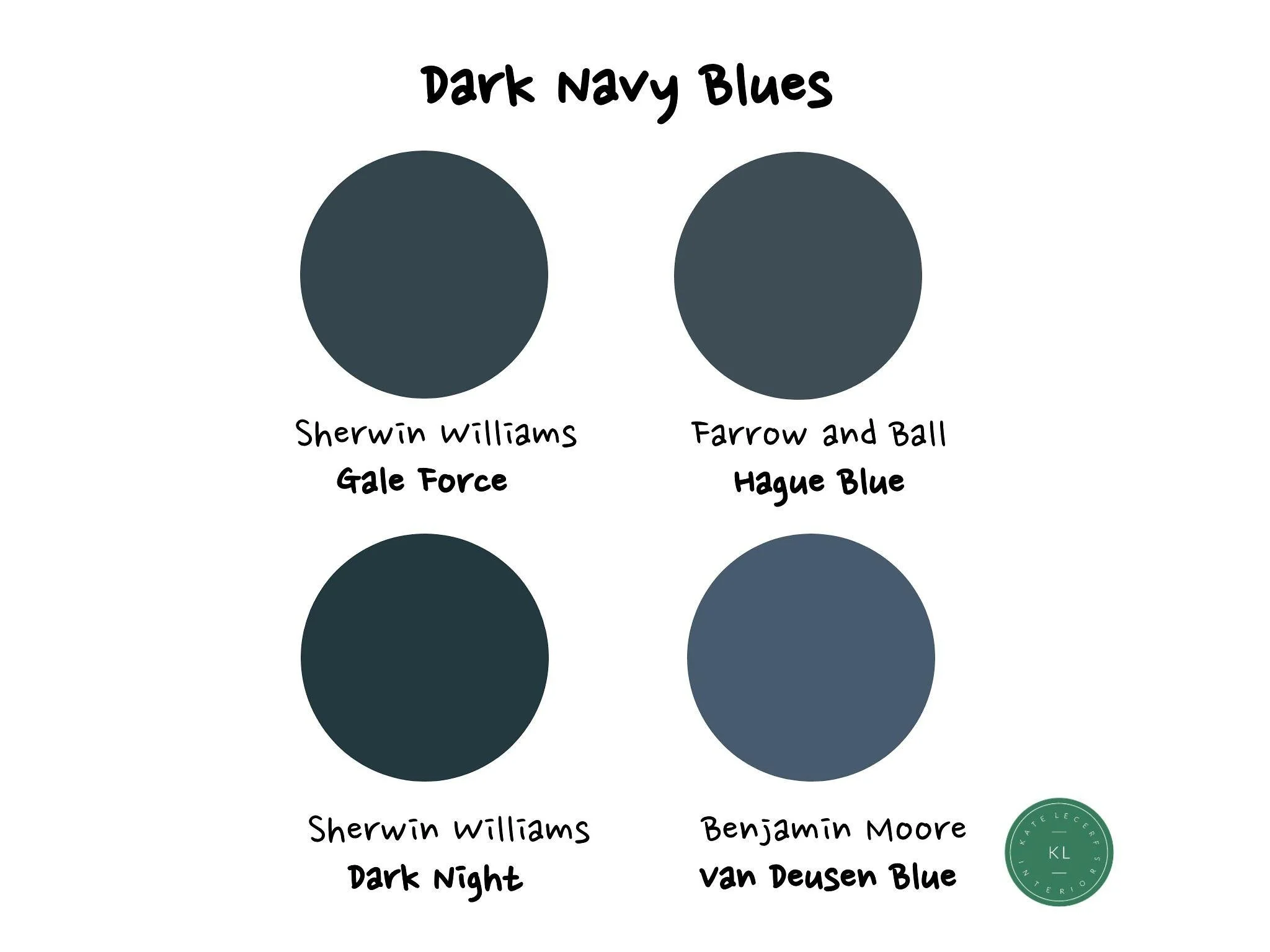
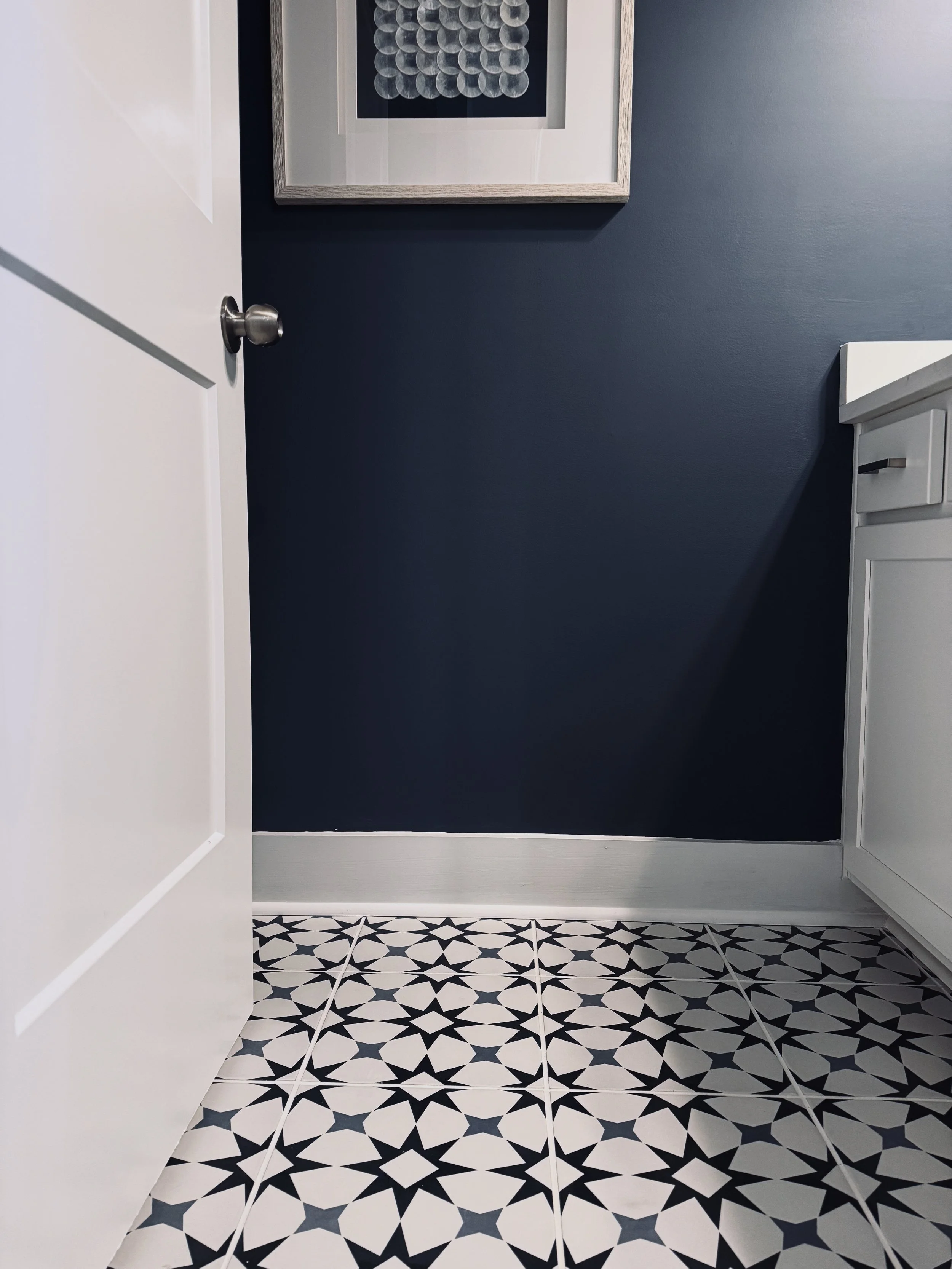
As a designer, I see navy blue as more of a neutral than a color. It works in any space and pairs well with almost any other hue—green, red, yellow, pink, brown, you name it. Navy can be an accent or cover an entire room, offering a dark contrast without going black and adding both moodiness and a classic, traditional vibe. Gale Force is a rich, gorgeous shade I used on my kitchen island, and seven years later I still love its chameleon nature—shifting from indigo to teal to deep navy depending on the light. Hague Blue is a true, very dark navy that also changes subtly with lighting. Dark Night is a deep blue with just a hint of green, reading more green in bright light—perfect for a moody, masculine space like the MCM office I paired with brown and soft red accents. Van Deusen Blue surprised me; lighter and grayish, it can lean toward a bright, almost purple-blue. I used it in a softly lit, windowless bathroom with blue and white tile, and it became the perfect cool coastal blue.
A few thoughts on these blues...
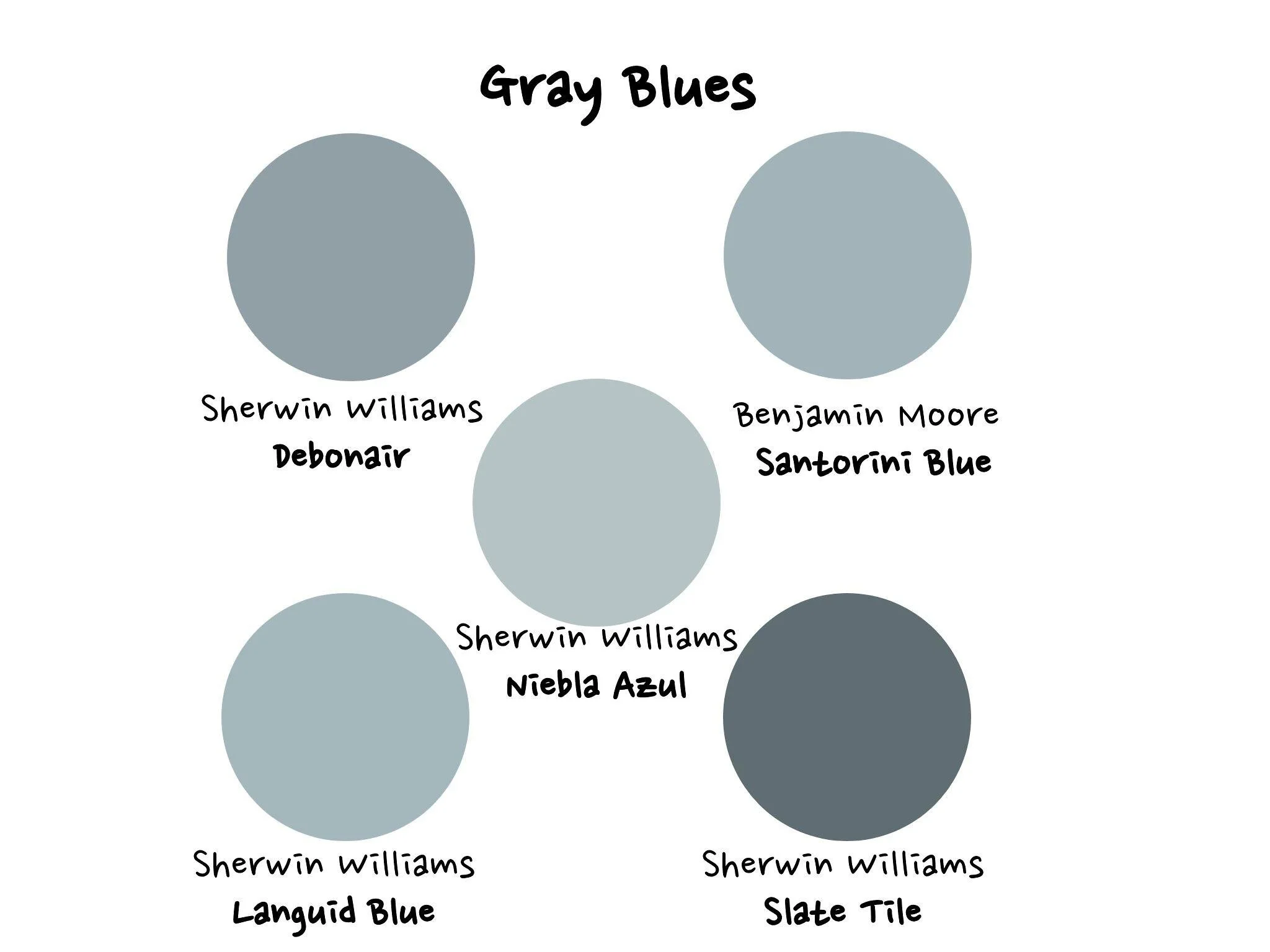
I don’t use “gray” paint, but I do love blues and greens with gray undertones. The gray softens the blue and gives it a muted, moody vibe.
Debonair is one of my go-tos. In a north-facing bedroom, it always looks stunning—versatile and perfect for a beginner moody blue that’s just the right balance between light and dark.
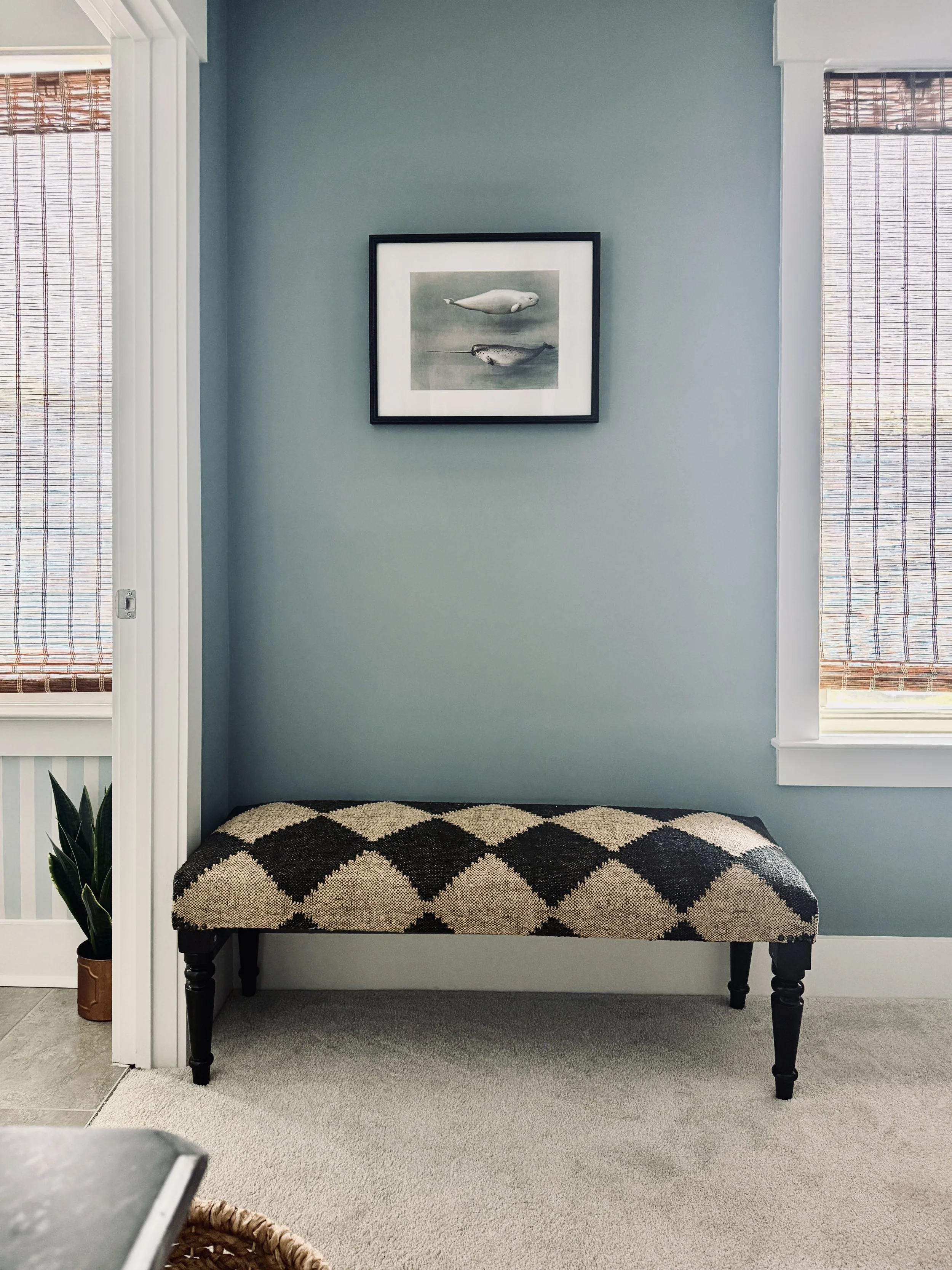
Niebla Azul is a lighter take on Debonair; they’re on the same color strip, so essentially the same hue in different tones. It can lean more toward gray, especially in my north-facing beach house kitchen and dining area. At certain times of day, it reads more blue-gray than blue, but still has that warm, inviting gray quality.
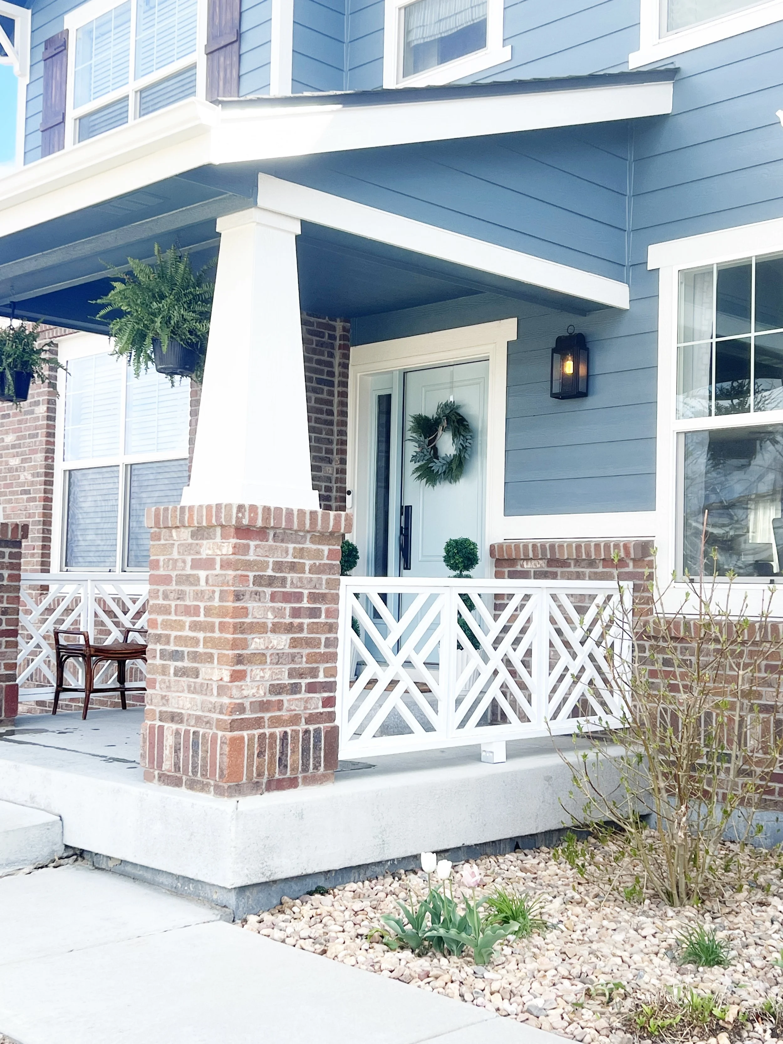
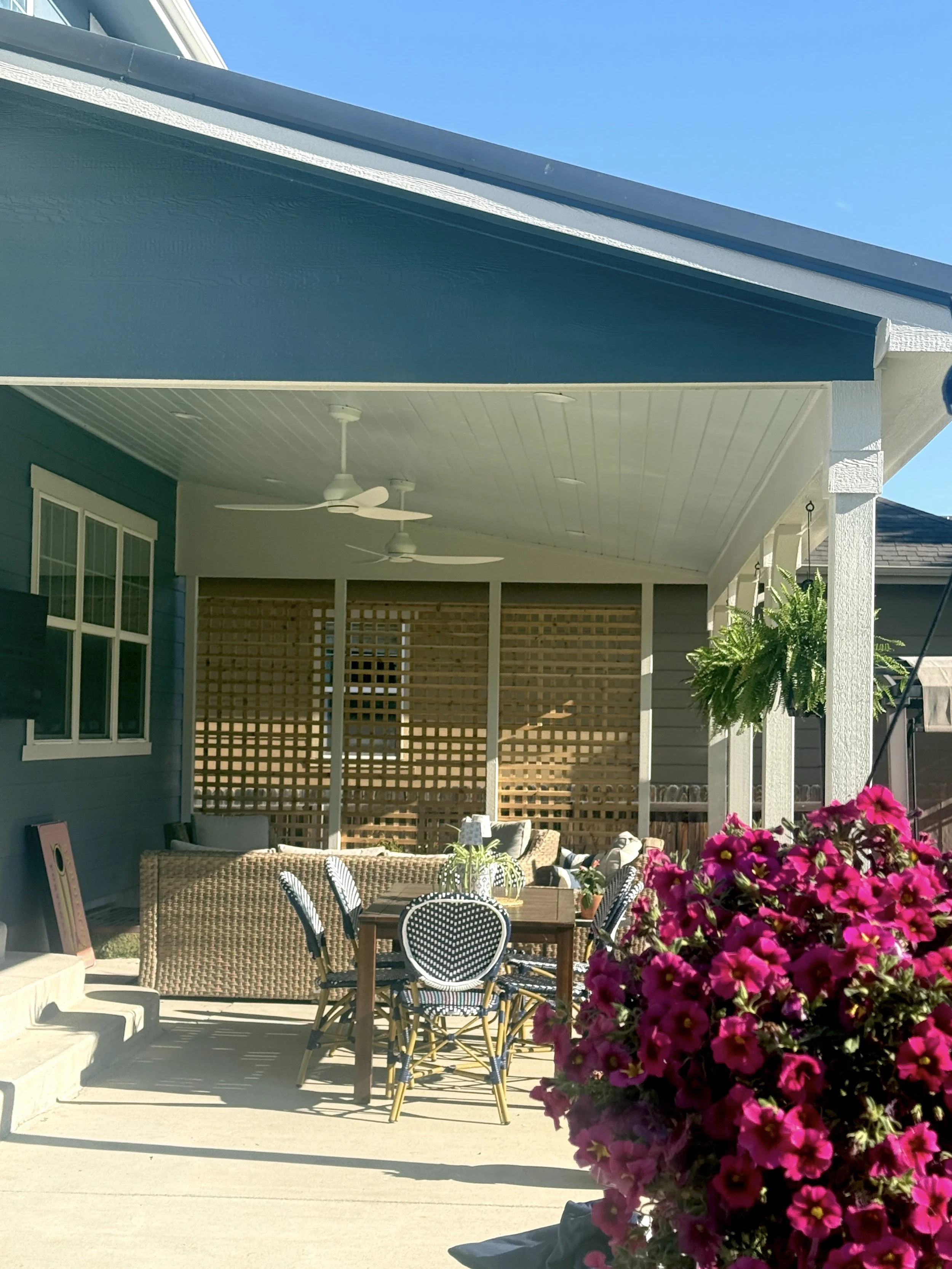
Slate Tile may appear dark gray on the swatch, but on my west-facing Colorado home exterior it looks incredible. Paired with Egret White and a Rain-colored front door, it takes on a blue cast instead of gray—exactly the look I wanted.
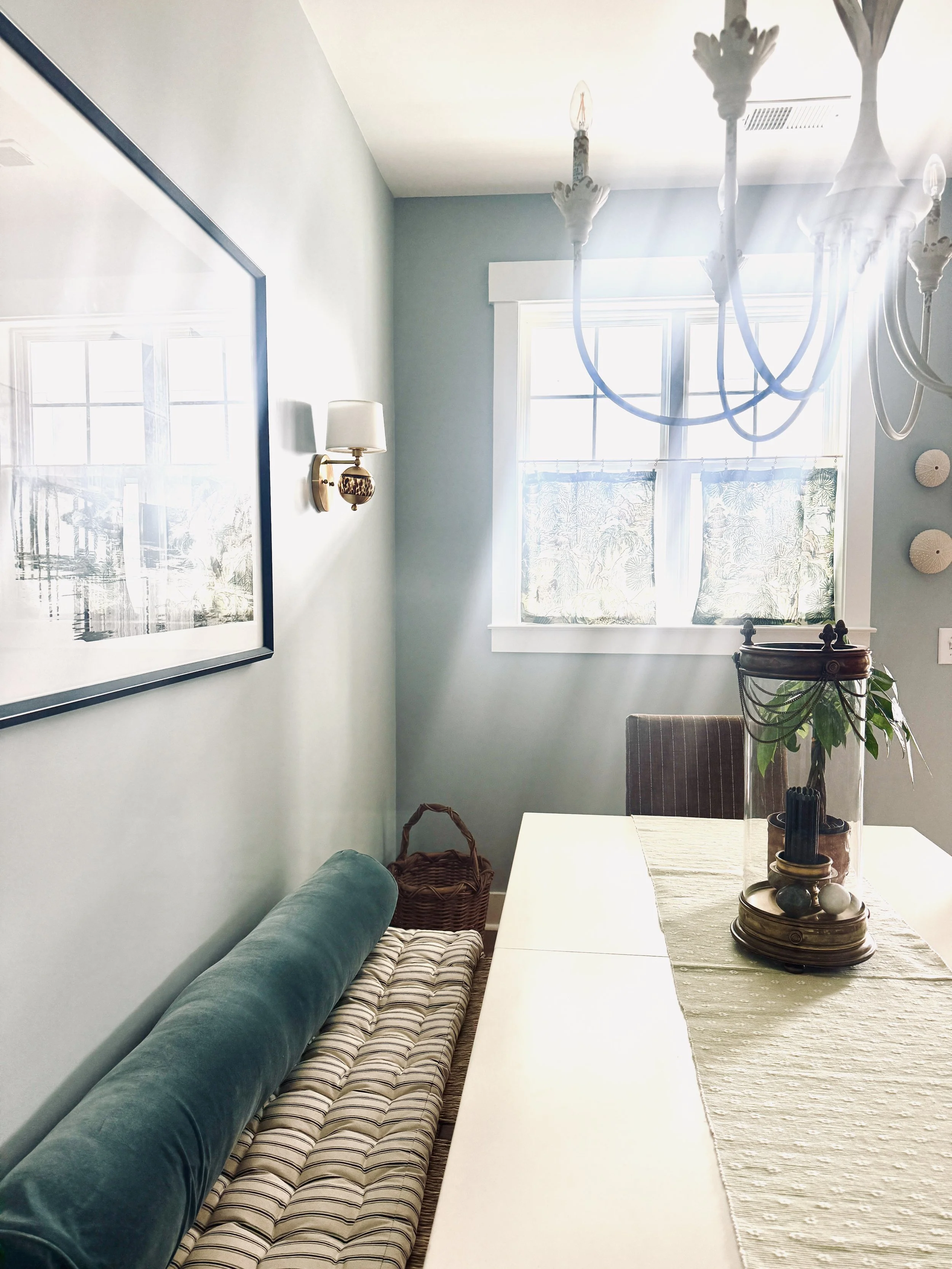
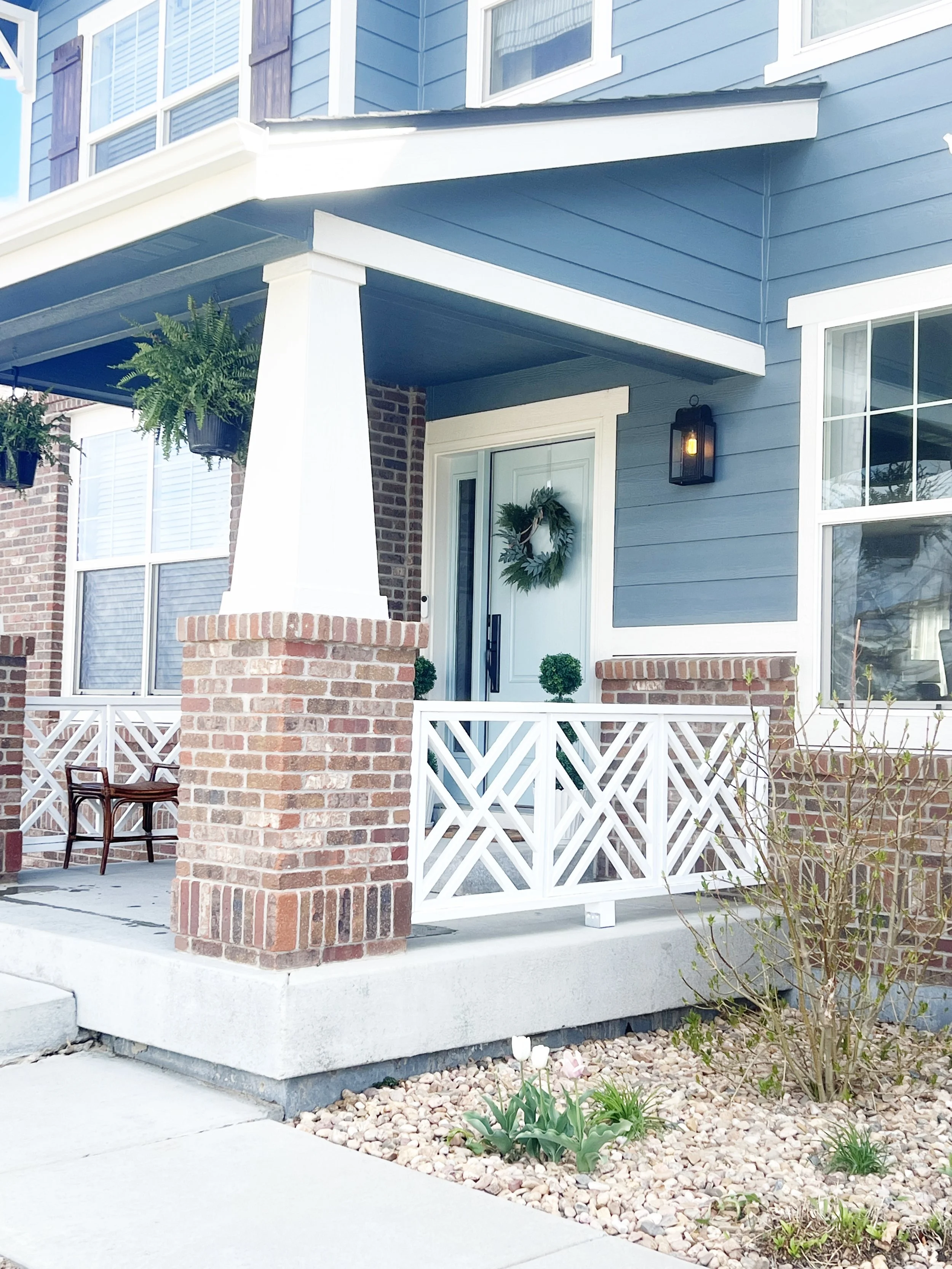
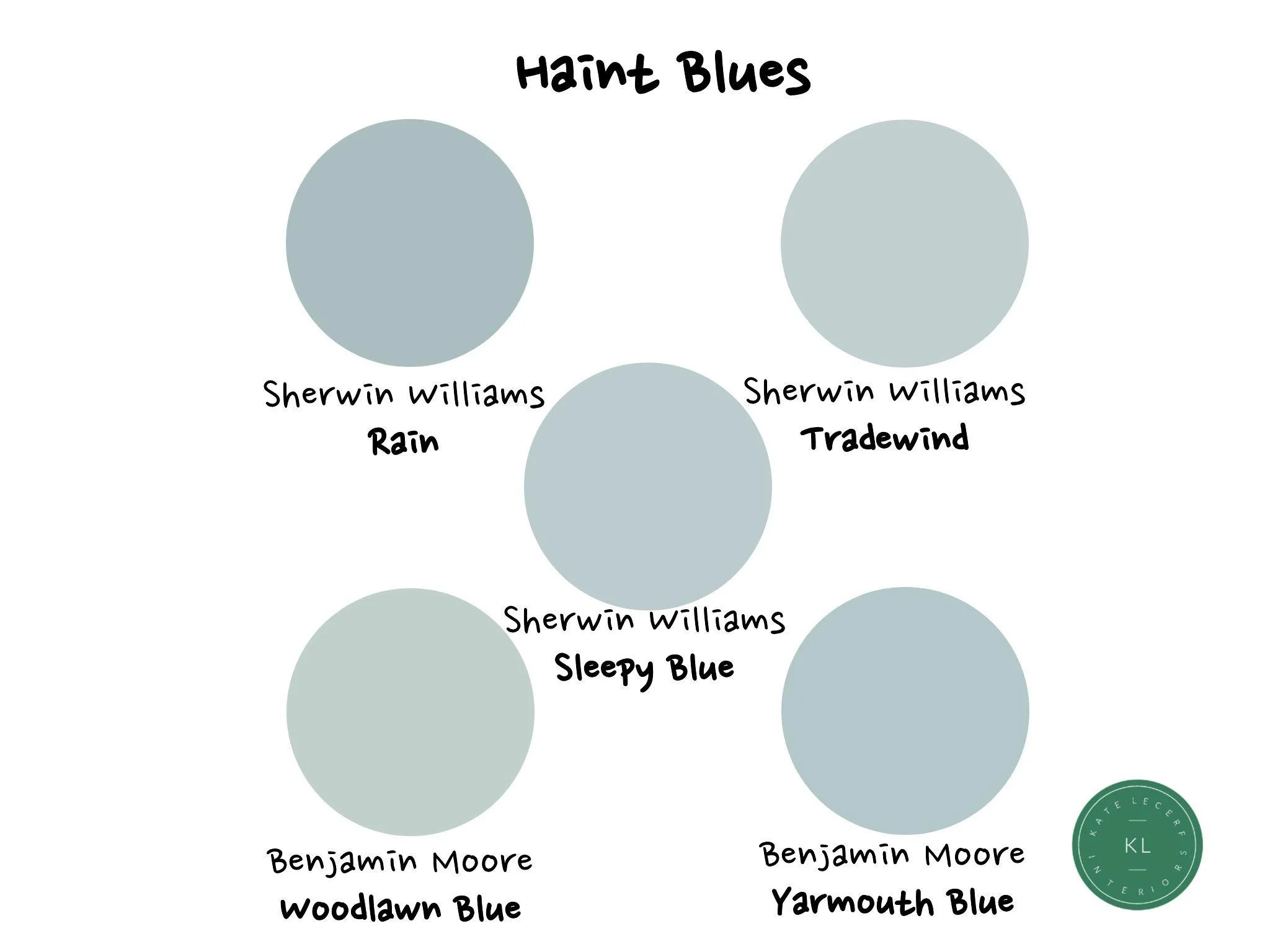
Haint blue is a soft light blue, sometimes with a hint of green, often used on porch ceilings in the southern U.S. Legend has it that it keeps evil spirits away, and it’s also said to repel insects, especially mosquitoes. I love using it as a nod to southern tradition. I painted my front door in Rain, but it’s just as lovely on a porch ceiling, pairing beautifully with Slate Tile and Egret White exteriors. Tradewind, a lighter take on Rain, was perfect for my porch ceiling. Choosing a ceiling color is quite different from picking a wall color—many porches are shaded most of the day, so it’s best to test the color at different times, even at night under artificial light.
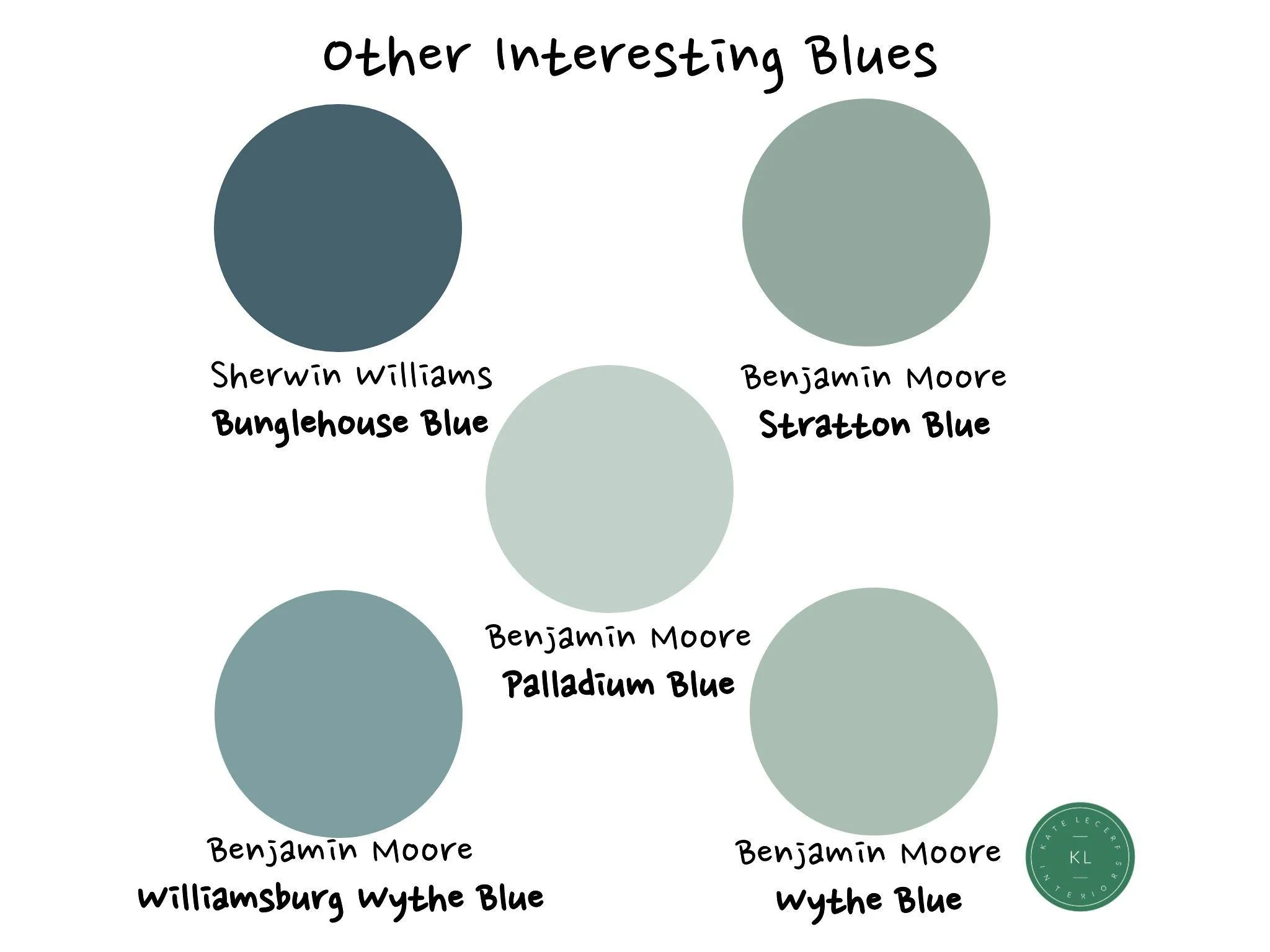
Here are a few other fascinating blues I’ve used, each with a subtle hint of green. That slight touch of green brings depth and warmth, making them inviting color options for any space.