How I got the Wallpaper Look with Paint
You’ve heard it before, I have textured walls. And if you have textured walls as well, then you know it makes decorating those walls sometimes challenging especially if you love wallpaper. I’ve put peel and stick wallpaper on ceilings, but I haven’t done it on my walls yet. I haven’t done it because I can’t commit! It’s a lot of work to put up wallpaper in an entire room, it’s expensive and no guarantees it will stay up.

Look at that texture! This is called knockdown which is very common in Colorado, Arizona and other parts of the southern US.
Impossible to unsee, but also very expensive to cover up.
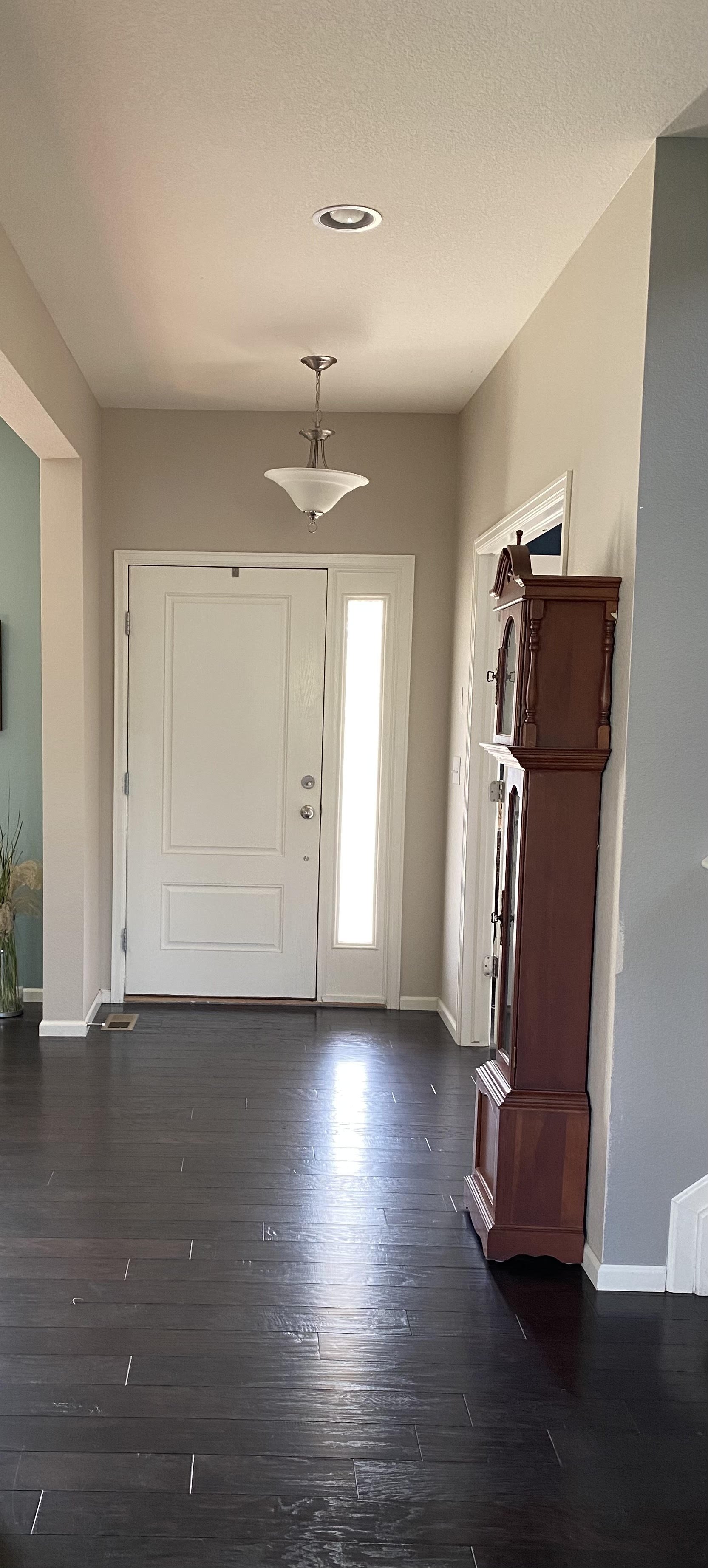
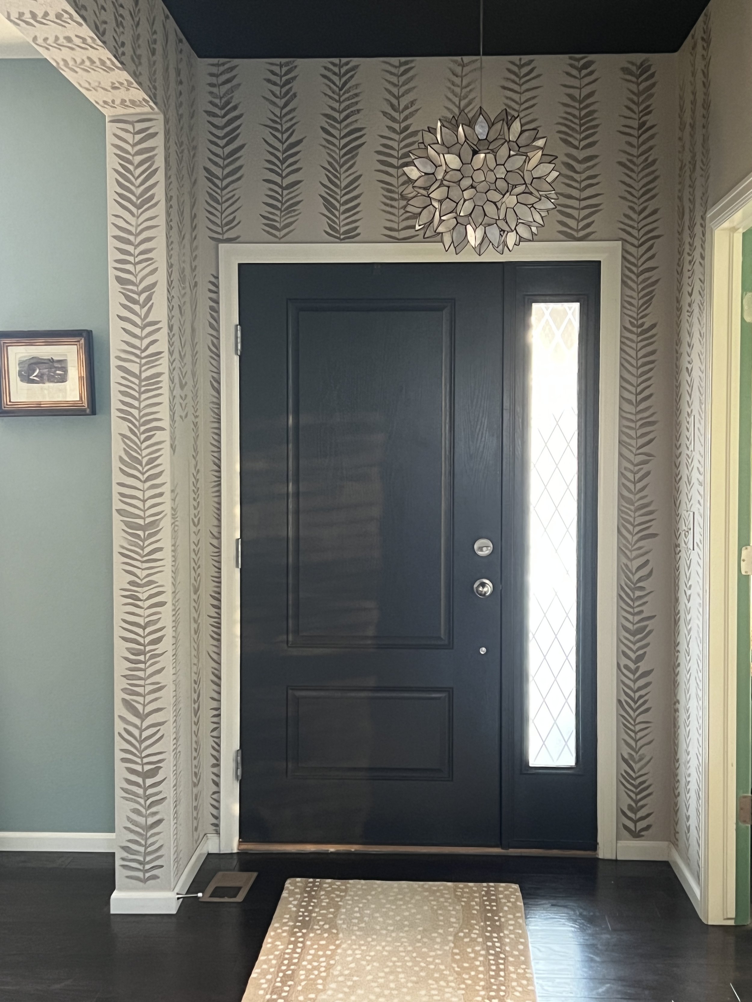
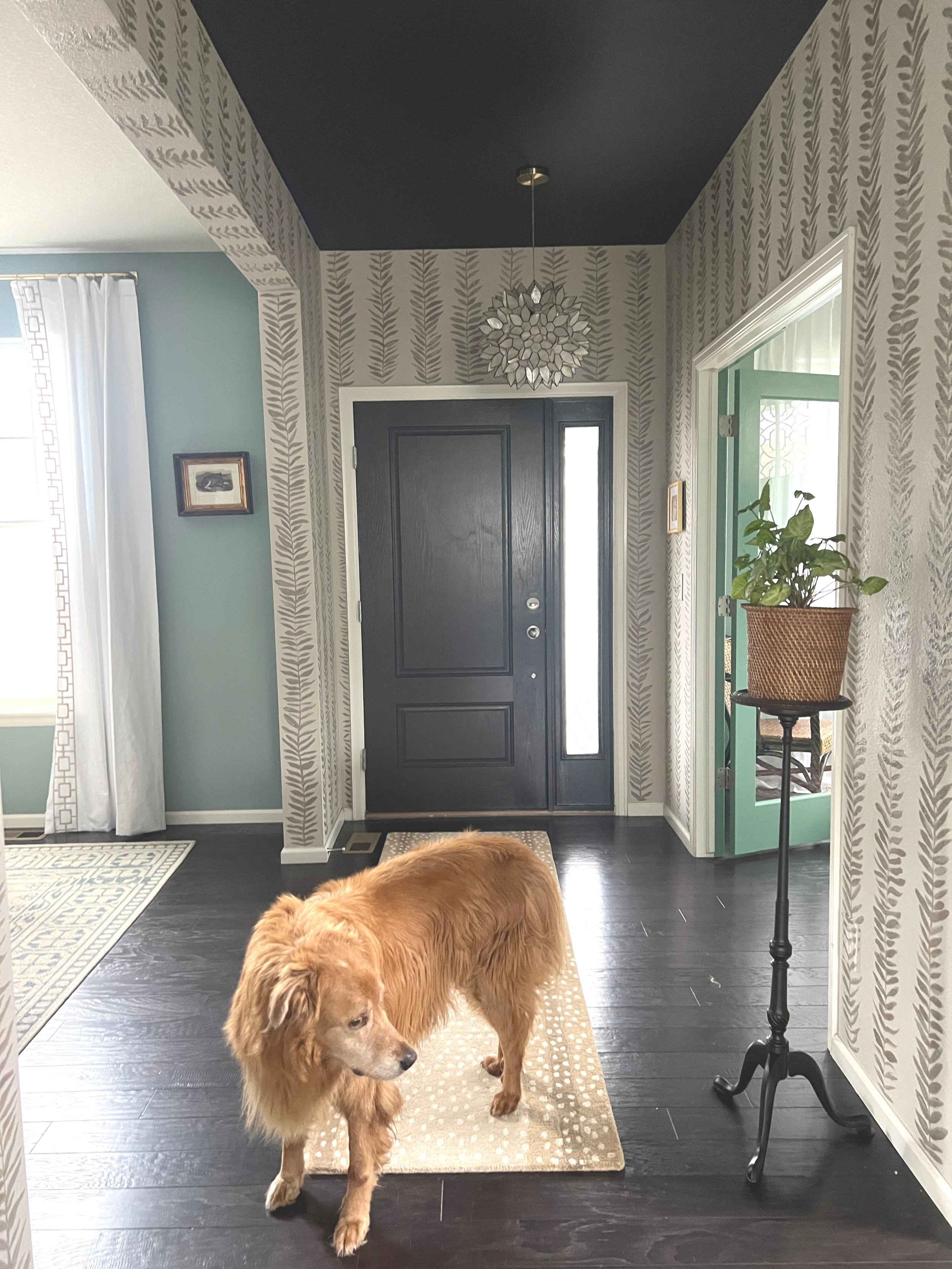
My entry way is boring. I do not have vaulted ceilings and it also opens up to two other spaces, my formal dining room and my home office both of which are painted different shades of green. I added a statement light fixture and painted the inside of my front door and my ceiling but the walls are neutral because like I said before it opens to two other spaces making any “color” difficult here. I’d like to add that painting the door and ceiling and replacing the light fixture made a HUGE difference. I discuss this in another post, but the black ceiling completely elevated the space, literally.
I have pondered the idea of using wallpaper here. But again, I have textured walls and I also need it to stay neutral. I just couldn’t find anything that I loved in a peel and stick with a neutral print I wanted to commit to.
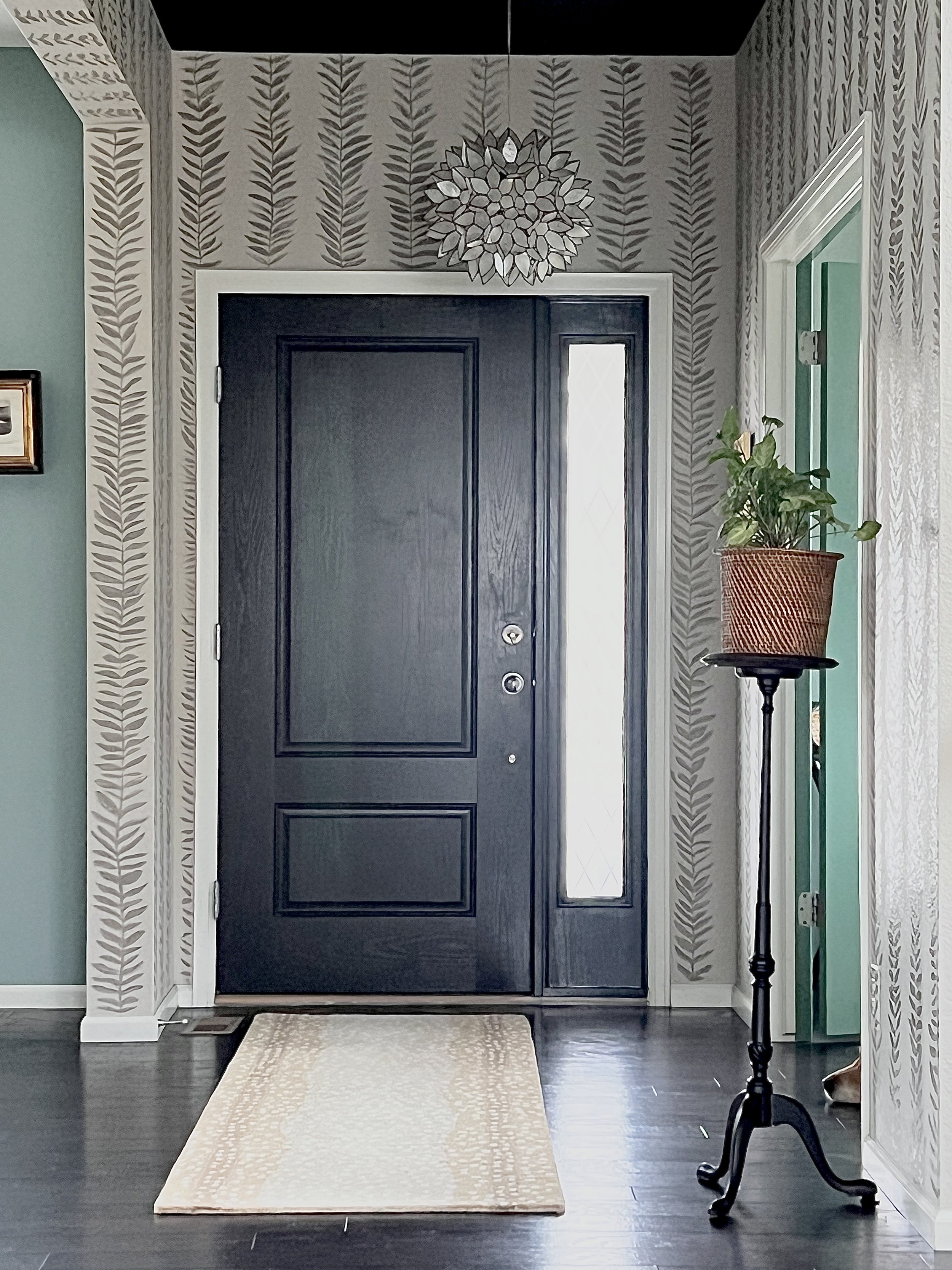
I saw a fabric that I loved the print and thought that right there is what I need in my entry way except it is fabric and it’s blue, so I decided to recreate this fabric on my walls. It’s a very simple organic block print and sort of looks like vines.
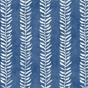
This is my inspiration for the painted wallpaper. It’s organic, so easy to paint because there can be lots of “happy accidents”.
As you know, I used to be an art teacher which involves an extensive amount of crafting which also includes loads of paint. So, I’m not afraid to paint anything in any medium even on walls. Want a mural? Why not?
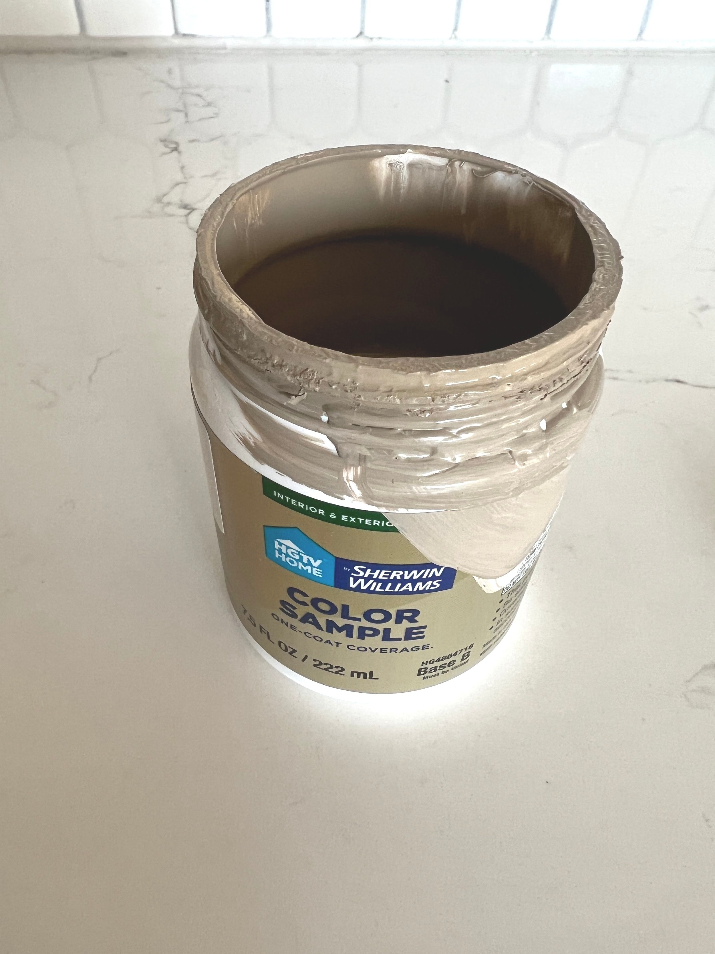
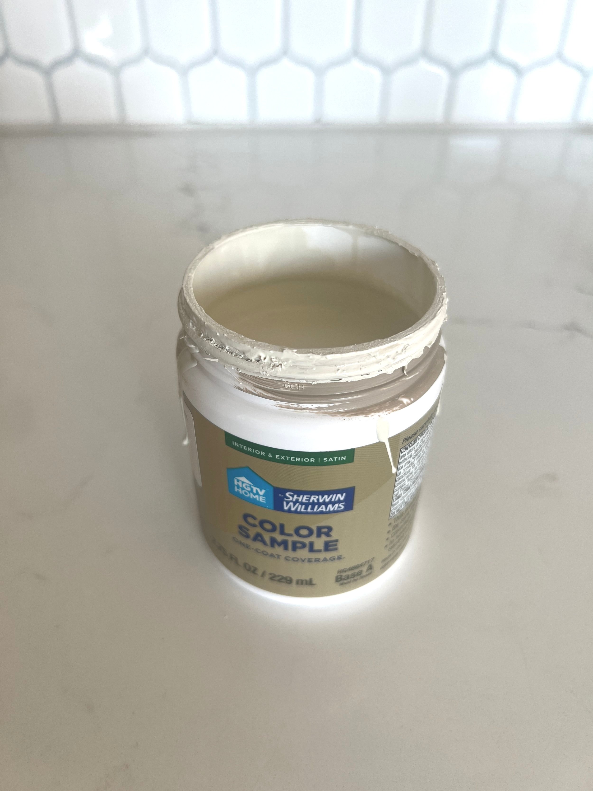
I knew I wanted to keep this pattern neutral on my already neutral walls, so I needed a darker neutral not black. I love Farrow and Ball paint colors. I love them because they have a very limited palette which can make it easier to choose a color and feel confident about it. Many will argue that you cannot color match Farrow and Ball colors with a different manufacturer. I disagree. I’ve been color matching for years and stand by it if you are only using that particular mixture. The only time I do not recommend color matching is if you started in the original formula and you are trying to match formulas from different manufacturers. That will not work.
Anywho, I chose Mouse’s Back for the pattern because it’s a dark, cool, grayish brown. However, I didn’t want my paint to be flat so I also got some SW Oat Milk to mix and use for variance. I’m very happy with the colors I chose. Those are sample sizes you can get and it was just enough for this project.
Next, I had to do some planning and figure out how I wanted to space the vines. I knew I wanted them to be evenly spaced stripes and then organically go from there.
I decided each vine including leaves should be about 5” wide and I wanted them about 3” apart. I did use a pencil and mark from the edge of the wall and first put small pencil marks all the way up the wall every 8”. That is where I lightly and organically painted the lines. I did not draw the lines with a pencil, I just connected the dots to make sure they were somewhat spaced evenly. I eyeballed it with the leaves because I didn’t want them to be perfectly spaced.
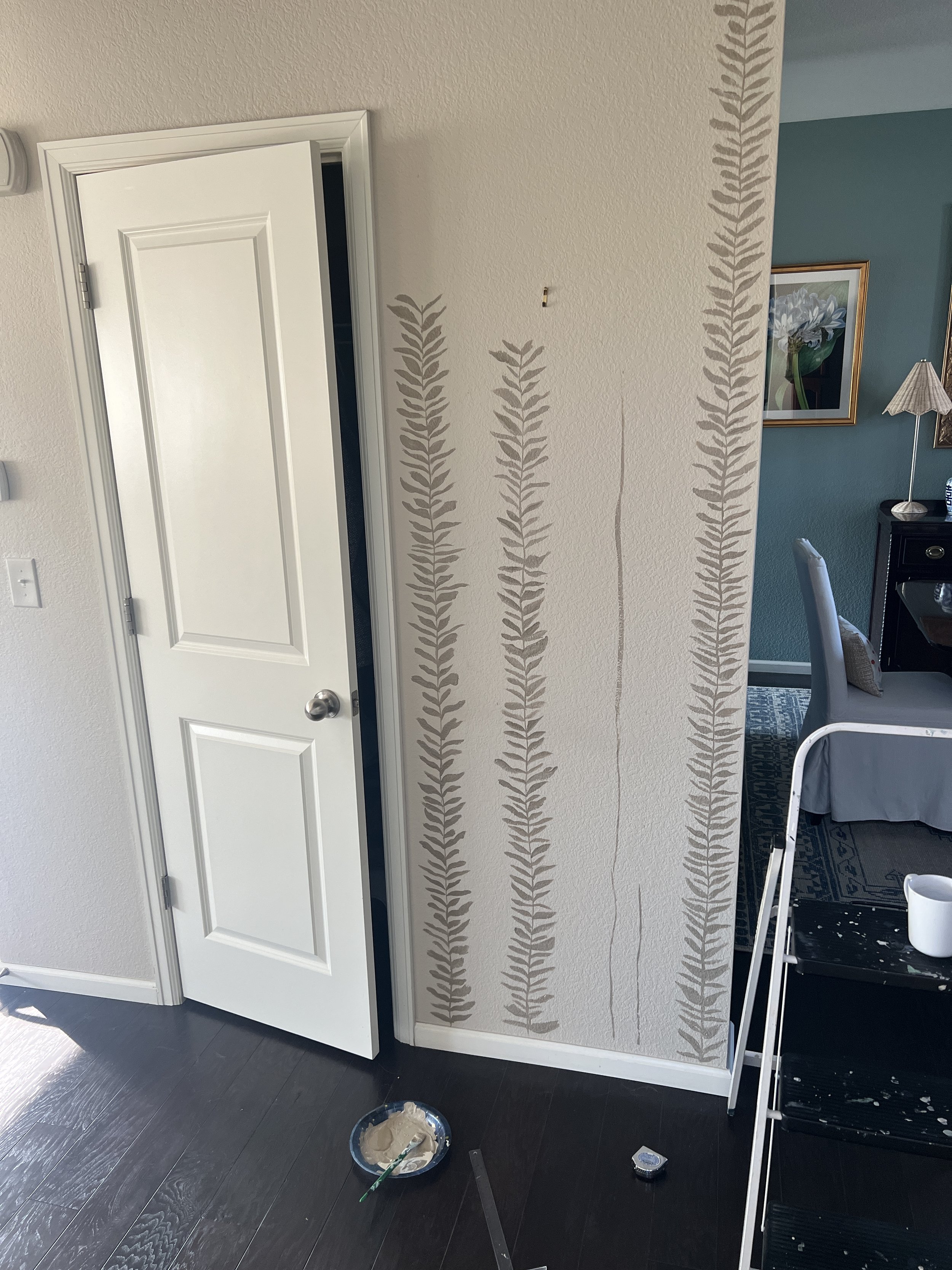
Being an artist, I know there is no precise way to mix the paint. I just lightly and haphazardly mixed a little here and there and added white highlights where I felt some definition was needed. I really only did this at eye level though. One thing as an artist that is difficult is that you really have to step away and look from afar a great deal. If you focus on details, you literally will never finish a project like this!
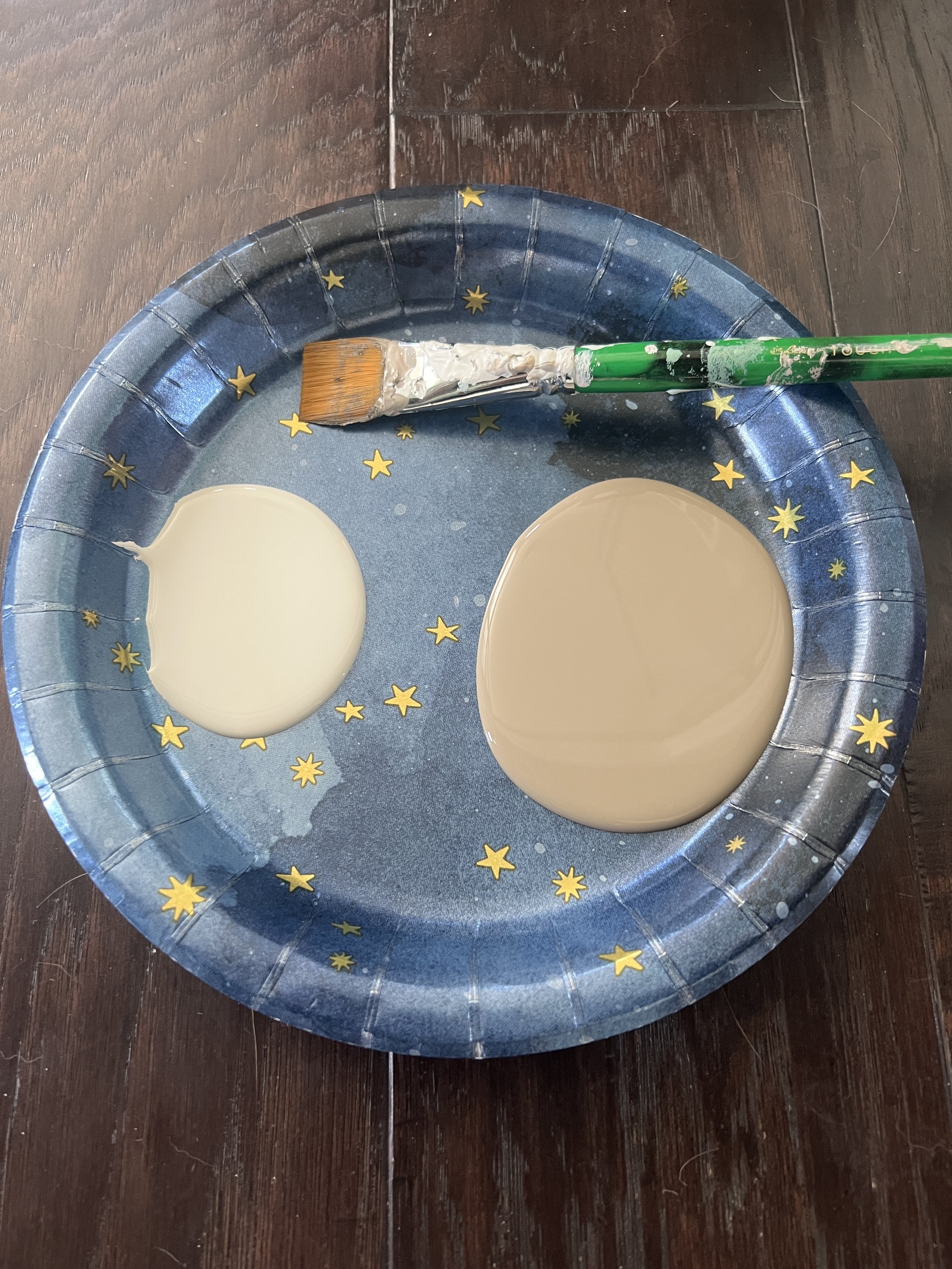
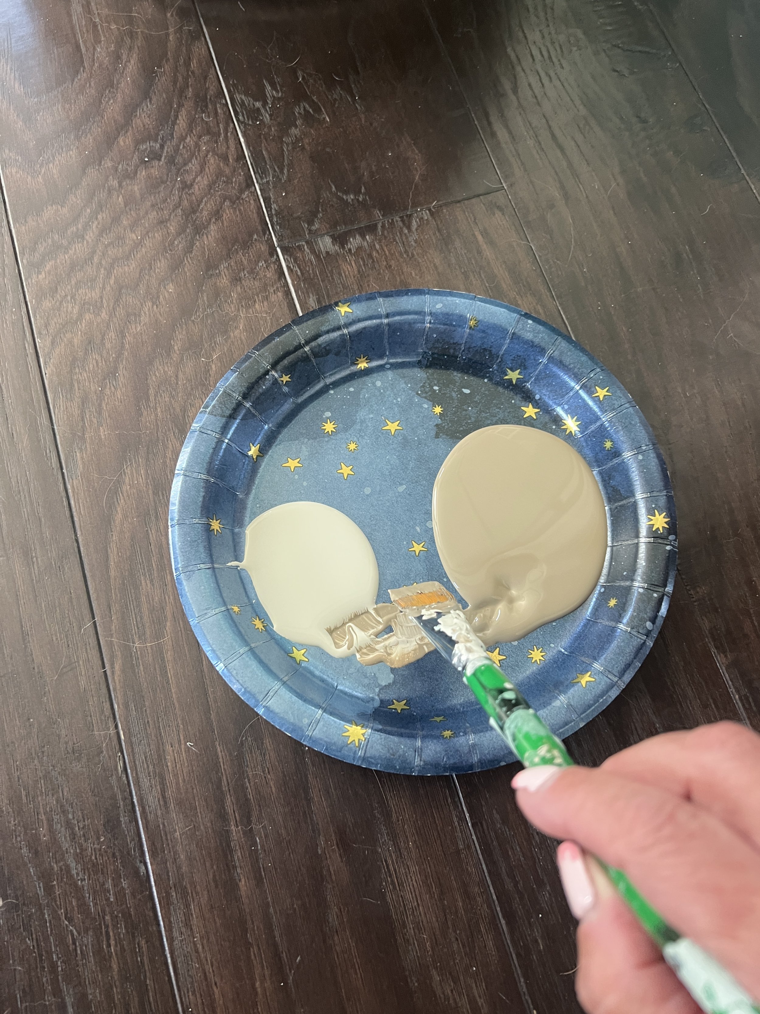

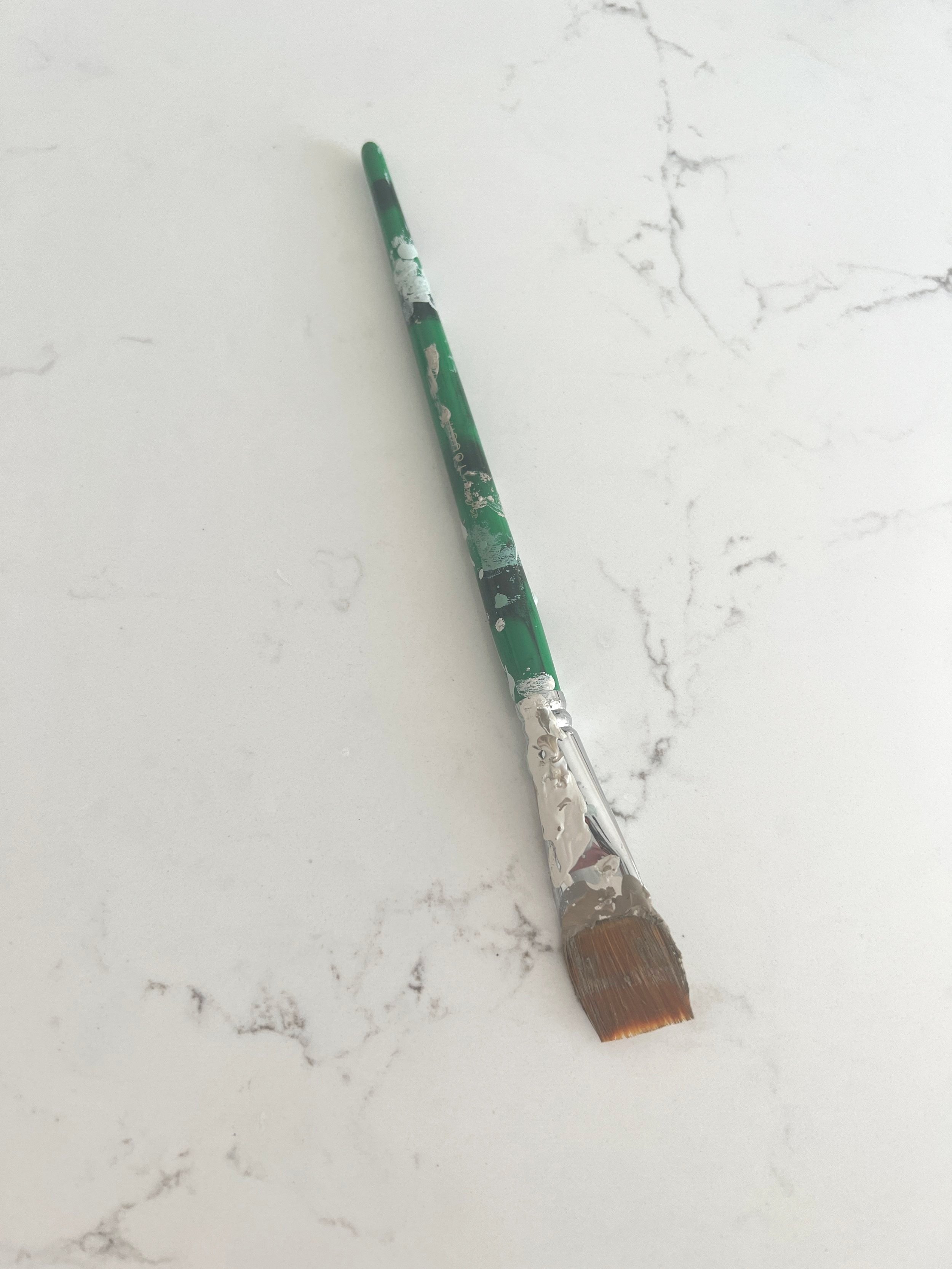
I did not buy anything special for this project. I used an old leftover birthday paper plate and a stolen paintbrush (from my daughter’s room). Total project cost about $12.
Here’s what you need:
Inspiration, nothing too detailed and very minimal coloring. I chose something that was “striped” because I wanted to elongate my walls and make them appear taller.
Paintbrush. I chose flat because I was painting lines and it made painting the shape of the leaves easier.
Interior latex paint, sample sizes are good if it’s a small space.
Pencil
ruler or t square
Go for it! Do not be afraid to try this. If you don’t like it, it’s only paint and can be covered very easily!