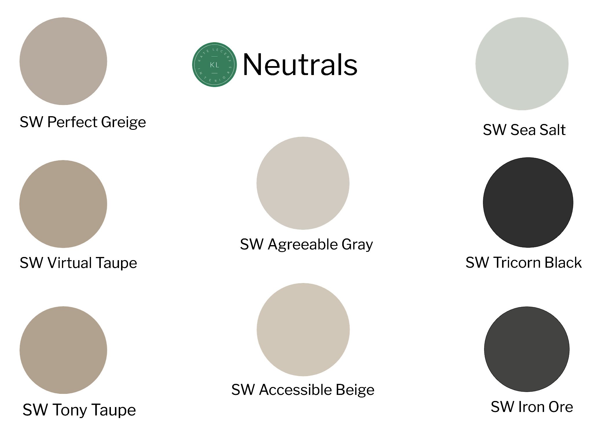
My Favorite Neutral Paint Colors
There are sooooo many paint colors to choose from. It is completely overwhelming if you don’t know where to start.
I’m going to help you out here. These are my go-to paint colors that look good in (mostly) any space. How do I know? I’ve used them all in one way or another.
First of all, there’s some important stuff to consider when choosing paint colors. You absolutely cannot just get the little samples at the paint or hardware store and decide then and there what color to use. We’ve probably all done it. I’ve done it before because well, I’m impatient. I’ve learned over the years, when considering paint it’s best to really take your time. Get the largest samples you can. Better yet, get a sample size container of paint and take it home.
Paint a section of wall next to your (white) trim on every wall in the room. Why? Because every wall takes light differently and you need to see it from every angle before making a decision. I’ll go into more technical paint facts in another post, but for now just look at the sample areas throughout the day and see how they look. It’s still difficult to visualize it in the entire room, but now at least you’ve tested it.
Here are my favorite neutrals. Keep reading for a few extra tips.
Painting Tips
When painting with black on walls, use a flat sheen paint. If you do eggshell or anything with more sheen it will be shiny and it’s not good on a wall, particularly if it’s textured. Both Iron Ore and Tricorn Black are fantastic colors for accents like doors and staircase railings and spindles. If you do this, use a gloss sheen paint.
Accessible Beige is currently in my home in all my common area rooms. Sometimes it looks white, sometimes beige and sometimes pale gray. It looks clean and fresh. It has a slightly green undertone. I also love Tony Taupe and Virtual Taupe. The great thing about all three of these colors is that they are on the same paint strip, meaning the taupes are basically just darker versions of Accessible Beige. Let’s say you’ve chosen Accessible Beige as your main house color, but you want something with just a bit more drama in an adjoining room. Guess what? Do not think twice about using one of these taupes as an accent. The SW paint colors numbers are #7036, #7038 and #7039. That’s how you can tell. They are all 703 numbers.
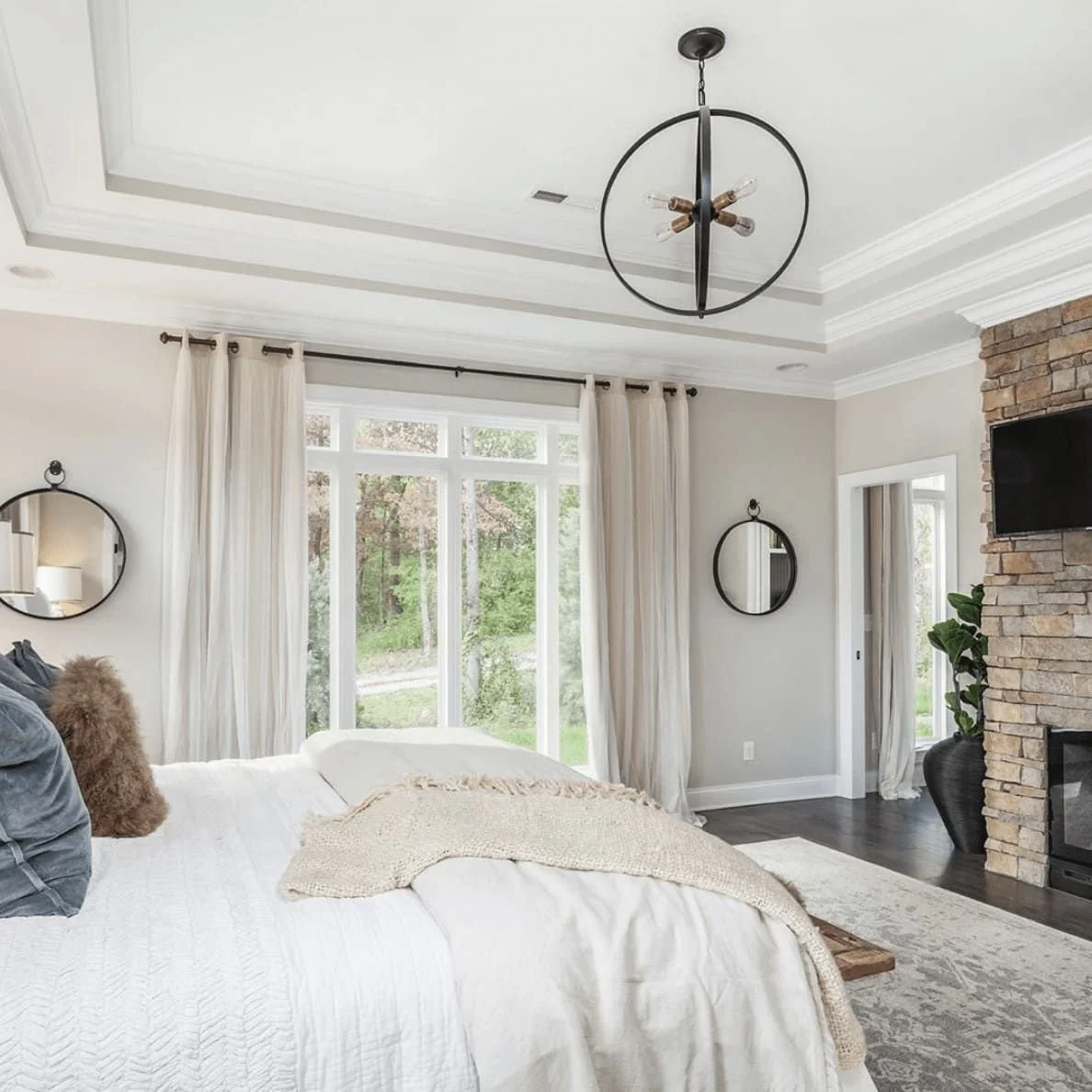
Agreeable Gray is truly an agreeable color. It looks good everywhere. It’s a very pale gray with no real undertone. I have this in a few bedrooms and mostly it looks like a very light, warm gray.
Sea Salt is a great color. It is gray with blue/green undertones. It is very popular in beach/coastal homes. It’s a crisp, bright gray. In my bathroom it looks light blue. I’ve also seen it look more of a sea green. Sometimes it just looks gray. I love colors like this. It makes things interesting, sort of chameleon-like.
Perfect Greige is a nice warm, well, greige. If you can’t decide between gray and beige, go with this. It’s more on the beige side than gray, but you won’t be disappointed. It’s a safe choice.
You’ll notice I didn’t choose any true grays here. That’s because I don’t recommend it. Popular colors come and go and while gray is still going strong, the time for cold grays is gone. In fact the previous owner of my home had the entire space painted darker, cold gray and I hated it the moment I saw it. It was one of the first things I did was paint a warmer and brighter color. Instantly, the home looked happier, brighter and cleaner with a fresh coat of paint.
SW Agreeable Gray
via Jenna Kate at Home

SW Accessible Beige via Houzz

SW Perfect Greige

SW Tony Taupe
via BHG

SW Virtual Taupe via Houzz

SW Sea Salt
via The Creativity Exchange

SW Tricorn Black via Sherwin Williams

SW Iron Ore via Sherwin Williams